 Over the weekend, an insert I have seen before several times dropped out of the Guardian. I always have a look - but today my boyfriend beat me to it.
A little later - checking that he hadn't put it in the recycling pile, he asked me what I thought.
Now, the conversations I usually have with him about such things are always interesting because other than his voluntary work, his work is a million miles from the not-for-profit sector
and he usually comes at things from a very different perspective (usually a legal one) to the point that we can disagree quite strongly.
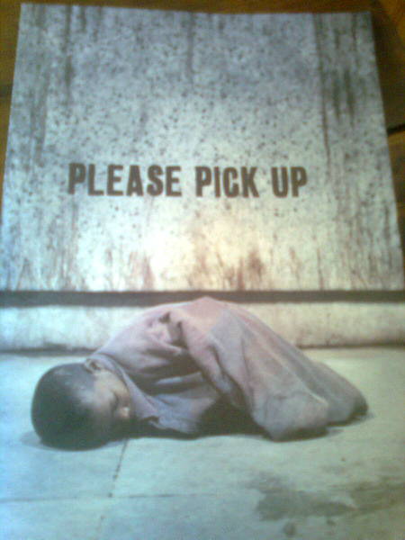
The insert in question is the UNICEF 'Please Pick Up' which I think visually is really compelling. But I am always interested to see what non fundraising people think. So with some devil's advocacy thrown in...the conversation went something like this:
Me: "What do you think of it?"
Peter: "Powerful photo and message - but it was ruined by the amount of copy inside it - unnecessary. Too much and not saying anything."
Basically a page of copy giving context and making the ask for £2 per month - several times (as he pointed out).
Me: "Don't you want to read about the what UNICEF is doing and the case for support to make the decision to support or not?"
Peter: "No, you don't need it - no child should be in that position. That's enough of a story."
Me: "But doesn't it tell you how you can help children like him and what is needed?"
Peter: " No - just goes on about £2 a month, probably not helping the little boy at all.
It's all about the organisation and nothing about how I will be making a difference specifically AND the copy font is far too small for anyone to find it comfortable to read (considering the size of the insert actually quite true). The original impact of the photo is weakened by the text."
Me: "Are you going to sign-up?"
Peter: "If I do, would need to know a bit more about where my donation would actually be going and what impact it would make - it's pretty vague."
Now this conversation took probably about a minute and hardly a detailed critique - but it was clear that Peter was not convinced. Now this is just one person's perspective - but it is still valid because for him there is something in the way of his support - and it could be easily rectified.
Now I am guessing that this is a pretty successful insert for UNICEF because I have seen it before, and I wish them the best of luck in their recruitment. But it made me wonder whether, despite the relative success of our banker communications, we do enough to test them in order to make sure they are as strong as they can be and I don't just mean the sign-up rates but also on-going retention figures.
And just importantly, thinking that all charities should probably have a Peter or a group of them to call on - ideally before work goes out, just to check whether we are ticking the necessary boxes with our advertising - which would be no bad thing at all.
Always thought it was a great front (and back) cover that gets you to define yourself by your initial action. It's then a choice of reinforcing that self-definition by giving or coming up with a reason why you shouldn't sign up to another DD.
ReplyDeleteThe request for £2 is just that. Many donors know it's far too little to do any good.
But the low recruitment cost approach works in tests - at least it does when it's run against £3, £4 or £5 a month requests. When you move the ask to £20, £30 or even £50 a month things look slightly different!
But not many charities even think of using higher value asks.
The fact is that there is a place for both of them - that's what targeting is all about.
The focus on the organisation is another problem. People don't give to charities, they give through them. A good insert should show a donor what their gift will do - not what the charity has done.
That said, I still like it. With a little re-working this insert could go from good to great.
I agree with you - creatively it is v. strong - and the assessor in question really liked the visual - it was the dissonance between wanting to 'pick up' the little boy ( a virtual cuddle that everything would be ok) but a dissonance with the copy. I agree with a few tweaks it could be truly great.
ReplyDeleteSometimes because we see things as working (by our definition) - we don't review them nearly enough - when things can always work better.
Thanks for reading Mark and for taking the time to comment.
A